The Diana Initiative
2021 branding
Year: 2021
Client: The Diana Initiative
Industry: Information Security
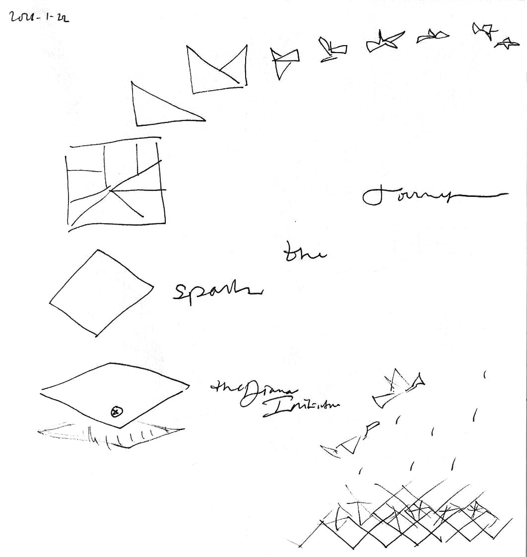
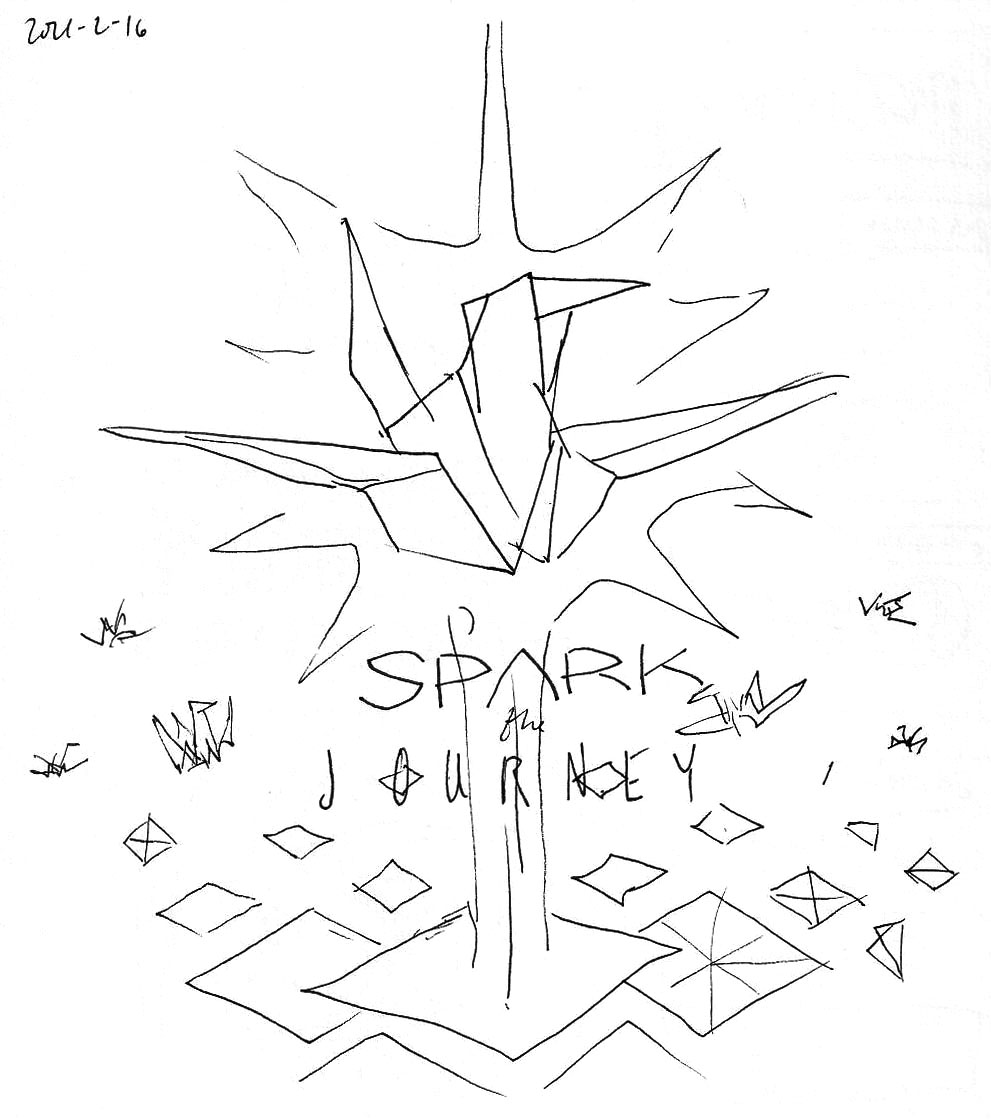
Project: Diversity in tech is getting better every year. The Diana Initiative is a two-day virtual conference that normally runs during Def Con. The speakers, sponsors, and the amazing people who run it have a singular focus on building greater alliances with all genders and colors in information security.
This year’s logo takes a break from the usual symmetry, reflecting how many of us are feeling right now. We maintain colors and typography from the 2019 organizational logo. The logotype is on the sleeve this time, symbolically over the spot where millions of people are currently receiving their vaccine. Origami paper cranes, when folded, grant a wish. We all have a wish in our hearts, and each wish is as unique as the individual. The cranes emerge from a flat square to a work of art, sparking a journey for better days to come.
Let us NOT go back to normal. Let’s look forward to awesome.
Contribution: Logo concept and design.
⇒ VISIT SITE
See the 2017 TiaraCon logo design
See the 2019 logo design
See the 2020 logo design
See the 2022 logo design
See the 2023 logo design

shirt sleeve logo
Human Process


For brand cohesion and consistency of use, all logos by Hotiron Creative ship with vector art, versions for light and dark backgrounds, single-color versions, alternate layouts (if applicable), as well as color codes for print and screen.
Say hi.
|